In this article, we’ll walk through a sleek and modern hover effect for Elementor buttons using only CSS. This effect adds a smooth vertical fill animation on hover, changes the icon color, and enlarges the icon slightly — all with a simple, clean structure.
🎯 Objective
We want to enhance the default Elementor button by:
- Creating a background overlay fill on hover.
- Smoothly animating the icon color.
- Slightly scaling the icon size.
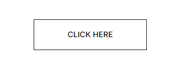
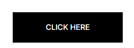
When it hover
.my-btn .elementor-button::before{
    content:'';
    position: absolute;
    background: black; /*<-- Change fill color here*/
    width: 100%;
    height: 100%;
    top: 0;
    left: 0;
    transform: scaleY(0);
    transform-origin: top; /*<-- Change fill out direction*/
    transition: transform .4s ease;
}

/*Hover class*/
.my-btn .elementor-button:hover::before{
    transform: scaleY(1);
    transform-origin: buttom; /*<-- Change fill in direction*/

}

/*Button text*/
.my-btn .elementor-button-text{
    z-index: 1;
}

/*Hover Icon*/
.my-btn:hover .elementor-button-icon{
    color: white;
    z-index: 1;
    transition: color .5s ease
}

/*Icone size */
.my-btn .elementor-button-icon{
    transform: scale(1.3);
    padding-left: 5px;
}
🧠 How It Works
- The
::beforepseudo-element acts as an invisible overlay that expands vertically on hover. - Using
transform: scaleY(0)andscaleY(1), we animate the background fill. z-indexandposition: relativeensure the button text and icon always appear above the animated background.- We enhance the interactivity by changing the icon color and size slightly on hover.
✅ Tips for Usage
- You can customize the fill color by changing
background: black;. - Change the fill speed via
transition: transform 0.4s ease;. - To reverse the fill direction, change
transform-origin: top;tobottom;. - Works great with Elementor’s Button widget inside a container or section.
📸 Result
When you hover over the button:
- A black overlay slides in from top to bottom.
- The icon becomes white.
- The icon slightly grows for emphasis.
🏁 Final Thoughts
This subtle but effective animation helps make your buttons more interactive and eye-catching without needing JavaScript or third-party libraries. Perfect for modern, clean designs.
Want to go further? You can combine this with text color changes, gradient backgrounds, or even diagonal fills using transform: rotate() tricks.


